Sales Analytics – Blue Raven Knowledge Base
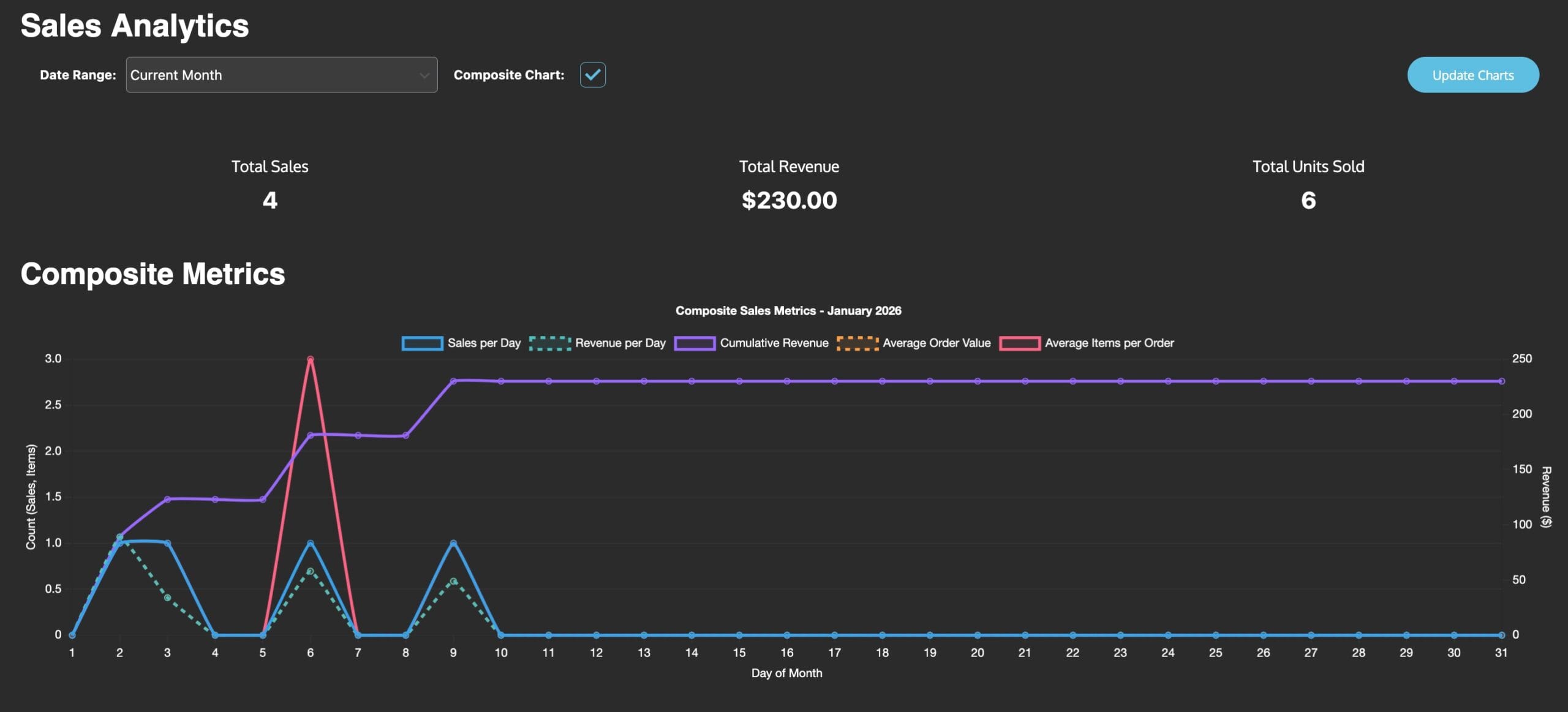
The Sales Analytics dashboard (found under Blue Raven > Home) gives WooCommerce store owners a clear, at-a-glance view of their store’s performance over time. It’s designed to be simple, visual, and actionable even if you’re not a data person.
This dashboard is available in both the free and Pro versions of Blue Raven. No feathers are used it pulls directly from your WooCommerce order data.
What You See on the Dashboard
At the top, you’ll find:
- Date Range Selector: Choose from:
- Current Month
- Last 12 Months
- Year to Date
- Custom Month (select any month from your store’s history)
Below that, you’ll see three key totals for your selected period:
| Metric | What It Means |
|---|---|
| Total Sales | Number of completed orders |
| Total Revenue | Total money earned (after discounts, before taxes/shipping) |
| Total Units Sold | Total number of individual items sold |
These numbers update automatically when you change the date range.
Composite Metrics Chart
This graph shows five key trends across each day of your selected month:
- Sales per Day (solid blue line)
- Revenue per Day (dotted teal line)
- Cumulative Revenue (solid purple line)
- Average Order Value (dotted orange line)
- Average Items per Order (solid pink line)
Each line uses a different color and style (solid, dotted, etc.) to make it easier to tell them apart even for users with color vision differences.
You can toggle the Composite Chart on or off using the checkbox next to “Composite Chart.” If you turn it off, you’ll see individual graphs below instead.
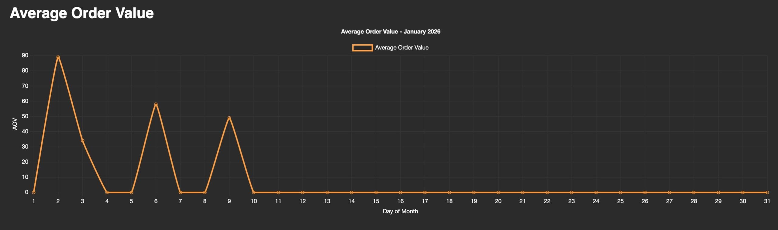
Individual Graphs (When Composite Chart Is Off)
If you disable the composite chart, you’ll see these graphs separately:
Average Order Value (AOV)
Shows how much, on average, each customer spent per order each day. A spike here might mean a successful promotion or high-ticket item sale.
Average Items per Order
Tracks how many products customers bought per order. A rising trend could mean your upsells or bundles are working.
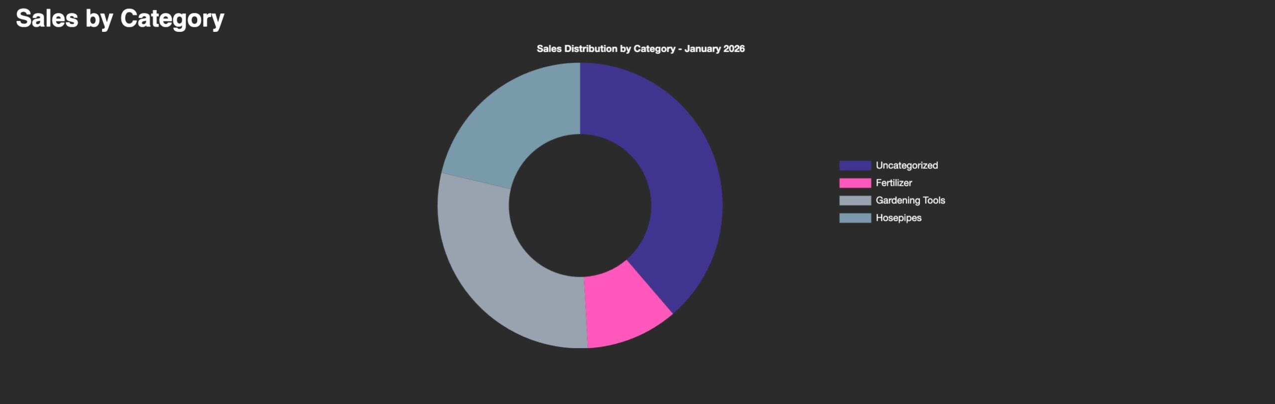
Sales by Category
This donut chart shows how your sales are distributed across product categories (e.g., Fertilizer, Gardening Tools, Hosepipes).
Colors are chosen for contrast and clarity, helping users with color blindness distinguish between slices.
Categories shown depend on how you’ve organized your WooCommerce products. If a product has no category, it appears as “Uncategorized.”
How to Use This Data
- Spot trends: Look for spikes or dips in sales or revenue—then check what happened that day (promotion? new product? technical issue?).
- Compare periods: Switch to “Last 12 Months” to see seasonal patterns.
- Optimize categories: If one category dominates, consider promoting others—or creating bundles around underperforming ones.
- Track AOV: If your average order value is low, test upsells, cross-sells, or minimum purchase thresholds.
Troubleshooting
- Graphs not updating? Click the “Update Charts” button in the top right corner.
- No data showing? Ensure you have completed WooCommerce orders in the selected date range.
- Category missing? Check that your products are assigned to categories in WooCommerce.
- Colors look washed out? The dashboard uses high-contrast colors for accessibility—but if you’re still having trouble, try adjusting your monitor settings or browser zoom.
Need Help?
Want to see more metrics? Submit a feature request.
Visit Blue Raven > Home to view your data.